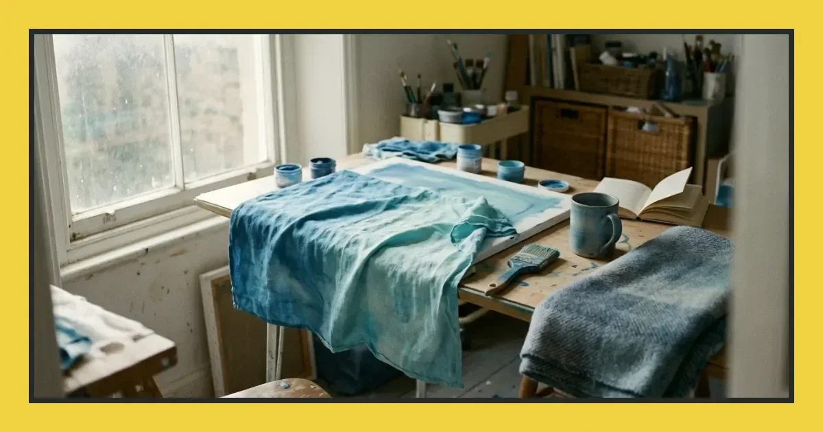
Coastal blue sits between the grey of weathered timber and the clarity of shallow water—a colour that carries distance and stillness in equal measure. This page shows you how to mix it, where it works in composition, and how independent artists at Eclectic Art Studio use it to shape atmosphere and meaning in their work.
Mixing coastal blue on your palette
Start with ultramarine or cerulean and cool it with a small amount of burnt umber or raw umber. The brown dulls the intensity without turning the blue grey. Add white to lift the value until you reach the softness you want. Test your mix on scrap paper first—coastal blue changes dramatically as it dries, especially in watercolour and acrylic.
For a warmer version, replace the umber with a touch of yellow ochre. The result leans toward turquoise without losing the haze that defines coastal light. Keep your ratios written down; this blue is easy to lose and hard to match from memory.
Understanding where this colour belongs
Coastal blue suggests space and air. It recedes naturally, which makes it useful for backgrounds, distant hills, or any area you want to push back in the picture plane. Place it behind warmer, more saturated colours and it deepens the sense of depth without competing for attention.
It also carries emotional weight. Used in large areas, it can feel calming or melancholy depending on what surrounds it. A single figure against a field of coastal blue reads as isolated; the same figure framed by warm ochres or reds feels held. Think about what you want the viewer to feel before you commit to it as a dominant colour.
Knowing when to choose a different blue
Coastal blue is not the answer when you need clarity or punch. If your composition demands a strong focal point, reach for cobalt or phthalo instead. Coastal blue works by softening and suggesting; it will not carry a bold statement on its own.
It also struggles in very dark passages. Adding black or more umber pushes it toward mud rather than shadow. For deep, saturated darks, start with Prussian blue or indigo and keep coastal blue for the transitions and mid-tones.
Comparing blues by role
| Blue | Best use | Mixing base |
|---|---|---|
| Coastal blue | Atmosphere, distance, quiet mood | Ultramarine, umber, white |
| Cobalt | Clear skies, direct light | Cobalt blue, white |
| Prussian | Deep shadow, night scenes | Prussian blue, burnt sienna |
| Cerulean | Bright highlights, water surface | Cerulean, white |
Building a palette around coastal blue
Pair it with warm neutrals—raw sienna, yellow ochre, burnt umber—to let the blue breathe without turning the whole piece cold. A small amount of cadmium red or alizarin crimson in adjacent areas creates tension and pulls the eye across the composition.
Avoid pairing coastal blue with very bright, saturated colours unless you want deliberate contrast. It works best in restrained palettes where no single colour shouts. If your work already feels busy, this blue will get lost or look out of place.
Applying coastal blue across different media
Oil: Thin washes of coastal blue over a warm ground create luminous skies and water. The transparency lets the underpainting glow through. Build up slowly; this blue can turn chalky if you add too much white too soon.
Watercolour: Wet-in-wet techniques suit this colour well. Let it bleed into warm greys or pale ochres for soft, atmospheric transitions. It dries lighter than it appears when wet, so mix stronger than you think you need.
Acrylic: Coastal blue in acrylic dries darker and more muted than oil or watercolour. Add a gloss medium if you want to keep some luminosity. Layer thin glazes rather than thick applications to avoid a flat, lifeless finish.
Learning from other artists' choices
Look at how coastal blue appears in work that holds your attention. Notice where the artist placed it, what colours sit beside it, and how much of the surface it covers. You will start to see patterns—backgrounds more often than foregrounds, large quiet areas rather than small accents, compositions that favour mood over detail.
Try limiting yourself to coastal blue, one warm and one neutral for a few studies. The constraint forces you to explore value and temperature instead of relying on colour variety. You will learn what this blue can and cannot do far more quickly than if you keep reaching for other options.
Moving forward with this colour
Coastal blue rewards patience and restraint. It will not save a weak composition, but it can unify a strong one and give your work a sense of air and quiet. Mix a batch, test it in different contexts, and notice what it does to the colours around it. The more you work with it, the more you will trust when to reach for it and when to leave it out.
Frequently asked questions
What pigments do you need to mix coastal blue?
Start with ultramarine or cerulean blue, add a small amount of burnt umber or raw umber to cool and dull the intensity, then lift the value with white until you reach the softness you want.
How do you stop coastal blue from looking muddy in darker areas?
Avoid adding black or too much umber to darken coastal blue. Instead, use Prussian blue or indigo for deep shadows and reserve coastal blue for mid-tones and transitions where it keeps its character.
What colours work best alongside coastal blue in a composition?
Pair coastal blue with warm neutrals such as raw sienna, yellow ochre or burnt umber to create balance. A small amount of cadmium red or alizarin crimson in adjacent areas adds tension without overwhelming the quietness of the blue.