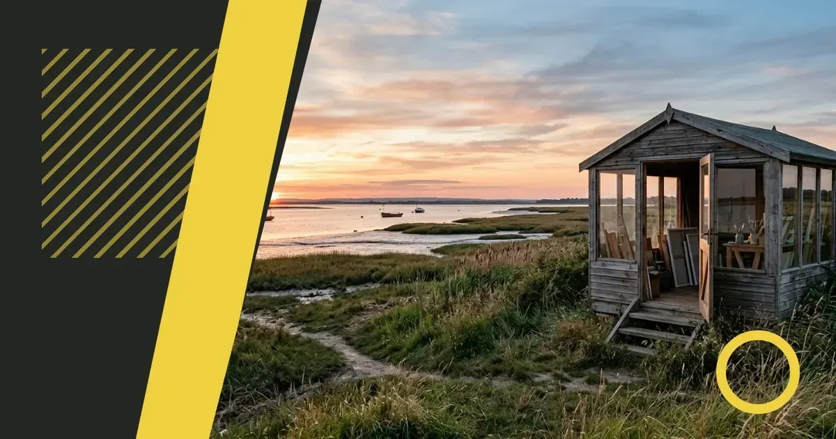
The Mersea sun range captures the shifting light of coastal landscapes — warm ochres, soft golds and the pale yellows of sand under morning sun. For independent artists working with natural colour, these shades offer a starting point that feels grounded rather than artificial. This page walks you through what makes the collection useful, how to incorporate it into your own work and where it fits within a wider palette. Eclectic Art Studio brings together practical guidance for artists building their craft outside traditional structures.
Recognising the palette's range
Mersea sun sits between the cooler tones of seascape greys and the deeper warmth of autumn earth colours. You will find shades that lean towards cream, others that carry more yellow, and a few with a hint of pink left by evening light. The range works well when you need a base that does not dominate but still brings warmth to a composition.
Each shade in the collection has been mixed to reflect a specific moment or condition of coastal light. Some are translucent enough to layer over cooler backgrounds; others are opaque and sit firmly on the surface. If you are working with natural pigments or trying to match a particular quality of daylight, start by testing a small amount on scrap material before committing to a larger piece.
Building layers without muddying colour
Layering warm tones over cool ones can flatten a painting if the underlying colours mix too readily. To keep the light quality of Mersea sun shades intact, let each layer dry fully before adding the next. This is especially true when you are working with watercolour or thin acrylic washes.
Consider these approaches:
- Apply the palest shade first, building towards the deeper yellows and ochres in areas where you want more intensity.
- Use a dry brush technique for the final layer to preserve texture without overworking the surface.
- Mix a small amount of white or a neutral grey into the Mersea shades if you need to lighten them without losing their warmth.
If a layer does start to muddy, lifting some of the wet paint with a clean cloth or sponge can restore clarity. Work quickly and do not scrub — a gentle press is usually enough.
Choosing materials that hold the colour well
Not every surface takes warm yellows and ochres in the same way. Cotton canvas absorbs pigment more readily than linen, which can leave Mersea sun shades looking less vibrant unless you prime the surface thoroughly. For works on paper, a heavier weight stock — around two hundred and fifty grams per square metre or more — will prevent buckling when you apply multiple washes.
Priming matters. A slightly absorbent ground lets the colour settle into the weave without sitting on top like a film. If you are working with oils, consider a traditional gesso rather than an acrylic primer; the former offers a more sympathetic surface for warm, translucent glazes.
Avoiding common mistakes when mixing your own versions
Many artists try to recreate coastal light by mixing cadmium yellow with a touch of white, but the result often looks chalky rather than luminous. Mersea sun shades achieve their quality by balancing yellow with a small amount of red or orange and, in some cases, a trace of grey to knock back the brightness.
Here is what goes wrong and how to correct it:
- Too much white produces opacity when you want translucency — add a glaze medium or a little linseed oil instead.
- Relying on a single yellow pigment leaves the mix looking flat — introduce a second warm colour in tiny increments.
- Skipping the cooling element means the shade reads as generic yellow rather than the specific quality of coastal sun — a touch of raw umber or a neutral grey shifts the tone without greying it out entirely.
Incorporating the range into promotional images
When you photograph your work for online galleries or print materials, warm yellows can shift under certain lighting conditions. Daylight from a north-facing window preserves the subtlety of Mersea sun tones better than artificial bulbs, which can push them towards orange or wash them out entirely.
If you are editing images digitally, adjust the white balance before touching saturation or brightness. A slight reduction in contrast often brings the warmth forward without making it look exaggerated. Avoid filters that add a universal warmth to the whole image — they flatten the distinction between your Mersea shades and any cooler colours in the composition.
Finding your next steps with coastal colour
Once you have worked with Mersea sun, you may want to expand into neighbouring palettes that complement its warmth. Soft greens and muted blues sit comfortably alongside these yellows without competing for attention. Charcoal or deeper earth tones can anchor a composition where Mersea shades might otherwise feel too light.
Experiment with small studies before committing to a full piece. Keep notes on which combinations work and which fall flat — your own reference library is more useful than general colour theory when you are trying to capture a specific quality of light. Trust what you see on the canvas rather than what a chart tells you should work.
Frequently asked questions
What kind of light does the Mersea sun palette best represent?
It captures the warm, diffused light of coastal mornings and late afternoons, particularly the pale yellows and ochres found in sand, weathered wood and sun reflected off water. The shades lean towards translucency rather than bold, saturated colour.
How do I stop warm yellows from looking muddy when I layer them?
Let each layer dry completely before adding the next, and avoid overworking the paint. Use a light touch and consider a dry brush for final layers to preserve texture. If muddying occurs, lift wet paint gently with a clean cloth rather than scrubbing.
Which surfaces work best for holding these shades without losing vibrancy?
Heavier cotton canvas or linen with a thorough primer works well for paint. For paper, choose stock around two hundred and fifty grams per square metre or more. A slightly absorbent ground helps the colour settle naturally rather than sitting on the surface.
Can I mix my own version of Mersea sun tones from standard pigments?
How should I photograph work that uses these warm coastal colours?
Natural daylight from a north-facing window preserves the subtlety better than artificial bulbs. When editing, adjust white balance first and reduce contrast slightly to bring the warmth forward. Avoid filters that add universal warmth across the whole image.
What other colours pair well with Mersea sun without overwhelming it?
Soft greens, muted blues and charcoal tones complement the warmth without competing. Deeper earth colours can anchor a composition where the yellows might otherwise feel too light on their own.
Should I test the shades before using them in a finished piece?
Always. Try them on scrap material or in small studies first, especially if you are matching a specific quality of light. Keep notes on successful combinations — your own reference is more reliable than general advice when working with natural colour.